Faultless Storm -12x9 inches encaustic on panel - Toni Youngblood, SOLD MPJH
Per Chance Summer -12x12 inches encaustic on panel - Toni Youngblood,
SOLD S.H.R
Red Clouds - 9x12 inches encaustic on panel - Toni Youngblood,
SOLD S.H.R
Winter Rose I - 12x9 inches encaustic on panel - Toni Youngblood, $600 framed.
Prelude - 12x9 inches encaustic on panel - Toni Youngblood, $600 framed.
Blue Wave- 12x9 inches encaustic on panel - Toni Youngblood, $600 framed.
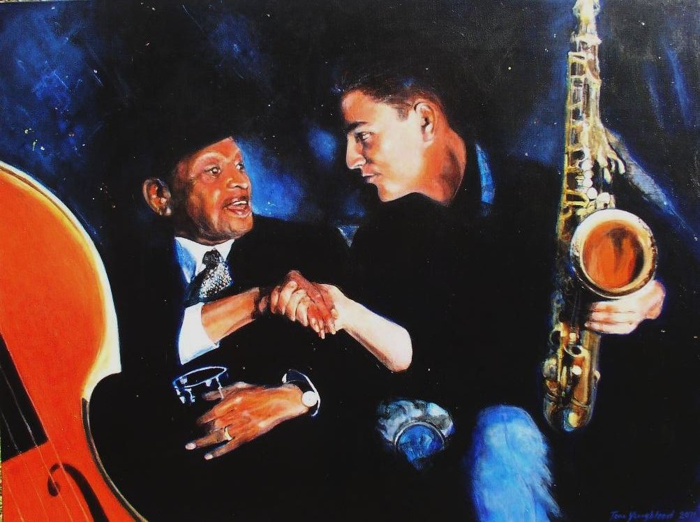
Above: Bass Player, 22"x22" encaustic on panel - Toni Youngblood, $1000
Above:
Avian Hills, 12"x12" encaustic on panel - Toni Youngblood, $600 framed
Above:
Artemis,12"x12" encaustic on panel - Toni Youngblood, $600 framed
Above:
Byzantium, 12"x12" encaustic on panel - Toni Youngblood,
SOLD S.H.R
Above:
Pickin' Up My Pieces, 12"x12" encaustic on panel -Toni Youngblood, $600 framed
Above: Hieropolis, 12"x12" encaustic on panel -Toni Youngblood, $600 framed.
Above: Freak Flag Flying, 12"x12" encaustic on panel - Toni Youngblood, SOLD MCR
Above:
Painting a Landscape, 12"x9" encaustic on panel - Toni Youngblood, $700 framed
Above:
Sweat Equity No. 1 - 12"x12" encaustic on panel - Toni Youngblood
SOLD (B.H.)
Above:
Sweat Equity No. 2- 12"x12" encaustic on panel -Toni Youngblood, $500 framed
Above:
Sweat Equity No. 3- 12"x12" encaustic on panel - Toni Youngblood,
SOLD (B.H.)
Above:
Allium -
Toni Youngblood,
SOLD (J.and K.H.)
Above: Beach Tide - Toni Youngblood SOLD (T.O.)
Above: Dreamt in Italian - Toni Youngblood SOLD (L.M.)
Above: Judy's Paintbrush - Toni Youngblood SOLD (K.C.)
Above: Lake Effect- 12"x12" encaustic on panel- Toni Youngblood $600 framed
Above: Spring Rain- 12"x12" encaustic on panel Toni Youngblood SOLD (T.S.)
Above: Suffering Happiness- 12"x12" encaustic on panel - Toni Youngblood SOLD (T.F.)
Above: Thank You, Mt. Etna - 12"x12" encaustic on panel -Toni Youngblood SOLD (D.S.)
Above: Todi - 12"x12" encaustic on panel -Toni Youngblood SOLD (S.and R.M.)
Above: View Through the Fence - 12"x12" encaustic on panel Toni Youngblood SOLD (V.W.)
Above: Where Music Lives- 12"x12" encaustic on panel - Toni Youngblood $600 framed
Above: In the Field of Forgiveness - 12"x12" encaustic on panel - Toni Youngblood SOLD (MW.)
Above:
Toulouse - 22"x22" encaustic on panel
- SOLD ( B. & T. H.)
Above:
Arriving At the Same Place From Every Direction - 22"x22"
SOLD (K.P.)
Above:
Pears in San Miguel - 24"x24", $1000
The four pieces below measure approximately 12 x 9 inches
Above:
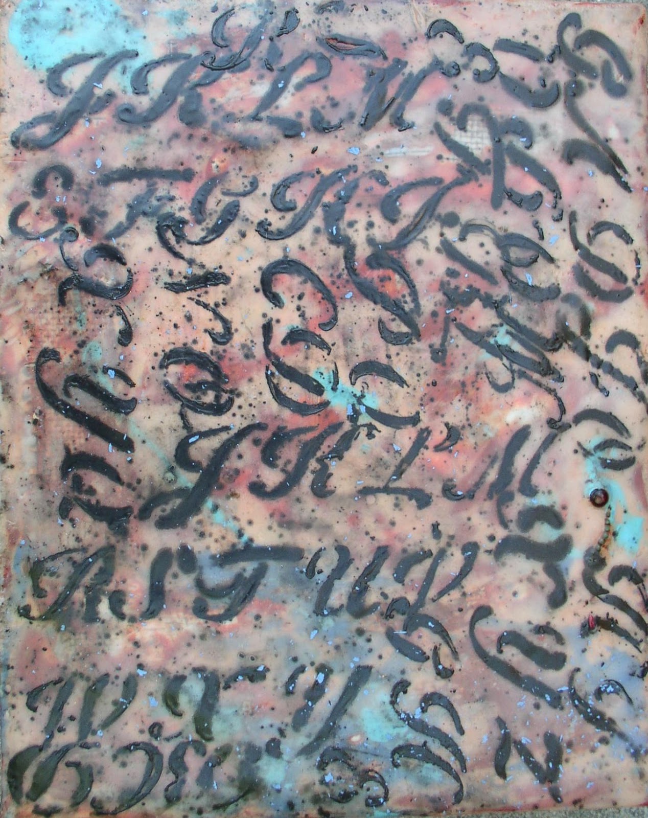
Cursive Is As Cursive Does, 12 x 9 inches $700 (Custom Frame)
Above: Don't Hide Them - 9 x12 inches Toni Youngblood, $600 framed.
Above: Living in Acronymia - 12 x 9 inches Toni Youngblood, $700 (Custom Frame)
Above: Patching the Infrastructure, 9x12 inches - Toni Youngblood, $600 framed.
Sketch Pad Series - The following twenty pieces measure approximately 7x5 - $100 each (including a display easel, unframed).
Above: C-Major - SOLD (D.H.)
Above: Canyon Storm - SOLD (C.R.)
Above: CEG 12 - SOLD (S.M.)
Above: Deep 8/Octave - $100 approximately 7"x5" Toni Youngblood ©
Above: F-Major - approximately 7"x5" Toni Youngblood ©
SOLD (S.H.)
Above: G-Major - SOLD (K.C.)
Above:
Letter D -
SOLD (R.D.)
Above: Letter H - approximately 7"x5" Toni Youngblood ©
$100
Above: Letter R - SOLD (R.McA.)
Above: Letter Z - approximately 7"x5" Toni Youngblood ©
$100
Above: Quick Note - SOLD (K.C.)
Above: Road Trip - SOLD (T.& R.W.)
Above: Script Note - approximately 7"x5" Toni Youngblood ©
$100
Above: Steady Time - approximately 7"x5" Toni Youngblood ©
$100
Above: Freel Peak - approximately 7"x5" Toni Youngblood ©
$100
Above: Kenai - approximately 7"x5" Toni Youngblood ©
$100
Above: Rainier - SOLD (D.S.)
Above: Saw Tooth - SOLD (R.McA.)
Above: Shasta - SOLD (R.McA.)
Above:
Teton -
SOLD (K.C.)
Calligraffiti - Toni Youngblood - September 2011
Along with my training in the tradition of representational drawing and painting, came rigorous design, analytical and critical dialogue. I learned to work with many materials and techniques in art school and later in graduate school in architecture.
During my painting studies, I chose elective courses in graphic design, which included the study of typography. Each week was spent learning the characteristics of a different typeface by carefully drafting the individual letters of its alphabet. The goal of this meticulous exercise was to facilitate the selection of appropriate typefaces for the design of graphic communication such as that used in advertising. The character of a typeface communicates something beyond the written message and may either support the message or distract from it. My interest in the imagery of the written and printed word is rooted in this early training.
After hand drafting alphabets in many typefaces, I have a great appreciation for computer typesetting and word processing programs, stencils and any other expedient tools and methods available to produce letters. With this detailed practice behind me, I am in awe of the phenomenon that only a few shapes or pen strokes can create a letter or symbol that, when appropriately grouped, produces words that express ideas. And I revel in the loose flowing motion of hand writing.
In three decades, my preference has evolved into using a broad brush and less literal technique. Rather than represent only what the eye sees---a compilation of physical features---I am more interested in interpreting what I see and feel in its essence, its nature. In music, it would be improvisation over straight melody. In some ways, I think this process is like designing a logo---paring down in graphic form the nature and essence of a business.
Beach tide as it glades across sand – Beach Tide, 2009
What I “see” when I close my eyes and listen to music – Where Music Lives, 2009
Cursive pen strokes of a hand-written message – Dreamt in Italian, 2009
A wave of bliss – Suffering Happiness, 2009
Mid-night rumblings of an active volcano on the island of Sicily – Thank you, Mt. Etna!, 2009
Warmth, texture and color of a favorite medieval Italian hill town – Todi, 2009
Calligraffiti is the continuation of a series of works I began a couple of years ago. Those first paintings were composed of layers of acrylic paint using a mask or frisket of wax---applying a layer of paint, applying clear wax frisket with a brush or drip technique, then applying paint of a different color, then removing the wax at critical points in the process to reveal color layers beneath. The resulting figures resembled written language in form, order and pattern.
The more recent works which are shown in this exhibit are created with encaustic (color pigment mixed with hot beeswax and damar resin crystals for hardening) and compatible mixed media, such as oil pastel crayon, paper pieces, nails and other found objects. Encaustic painting, as a medium, is over 2000 years old.
Toni Youngblood – Salt Lake City, Utah
Bachelor of Art – Painting, California State University, San Jose
Master of Architecture, University of Washington, Seattle
Also on display during the exhibit at Charley Hafen Jewelers - Gallery is the portrait commission I painted for musician David Halliday, Lionel Hampton & David Halliday, acrylic on canvas, 30x40 inches, 2011...SOLD


No comments:
Post a Comment